Chapter 11: The Future of Silent Film – Intertitles
What follows are my thoughts and research on intertitles (or sub-titles) in silent film, originally written for the series of blog posts that became the basis for my book The Silent Film Universe. I think these may be of interest to both silent film fans and scholars and to anyone interested in making new silent films.
With Titling, Size Does Matter
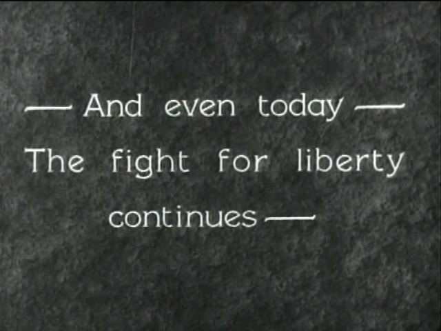
Sub-titles in silent film are easy to read. They have to be. They interrupt the action, throw us a bone (or two), and hop back off the screen. Along with the economy of the text and the screen-time duration, the way the text is laid out was also pretty consistent throughout the silent era.
Ask anyone in publishing, and they’ll tell you basic rules about font size, margins and line-spacing. There are loads of posts and online articles about this. I found this out when I published Steve Massa’s book Marcel Perez: International Mirth-Maker and when I did the layout for the booklet that was included in the initial run of discs of When Knighthood Was In Flower.
It’s something you notice when you have a hard time reading or tracking text in a book or a pamphlet. Or in a title card. You may not be aware of why you’re having a hard time reading, but it’s some basic scale and ratio rules aboutu type size, margins and line-spacing.
In silent film titles, the exact type size and line spacing may waver a tad from one studio to another, but just a small bit. I’ve re-made or made new title cards for digital editions of silents many times. My method is always to take a few frame grabs of other ones from a film from that studio and year, and create a layer in Photoshop on top of one of them, and then match the type size, margins and line-spacing so it’s exactly like what I’m seeing in the original.
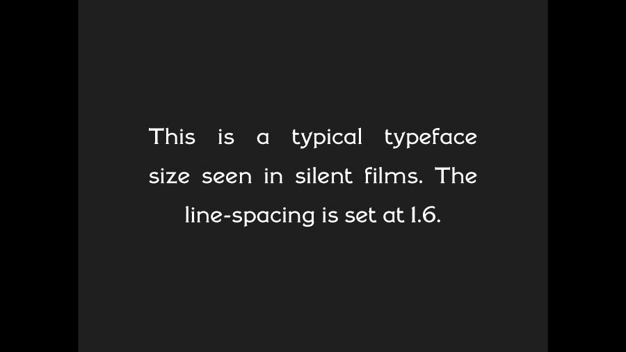
What this has taught me is what I’ve seen forever, and perhaps you as well, that throughout the silent era, regardless of the typeface of hand-lettering style, these measurements pretty much hold steady from the early ‘teens through the end of silent movies. There are a certain number of words that can be a maximum number on a title card before you either have to shorten sentences or carry the text over into a second title.
But, along with the economy and style of the writing – whether it’s exposition or dialog – the onscreen text size, margins and line-spacing seems to have gotten set early on and remains the same year after year. What fascinates me is the fact that whatever these standards were, even if they were unwritten, they somehow evolved quickly and early.
They were designed for ease of reading. The only thing that changes during the 1910s and 1920s are the variety of typefaces and hand-lettering styles, and what sometimes appears behind the text.
We Had Typefaces Then
The typefaces and hand-lettering styles in films from the silent era do not have a wide variety, and for the most part they were already familiar to audiences. There are maybe five or six that one sees in a majority of silent movies, but they’re also visible elsewhere, in print media.
With the exception of sub-title (or as we call them today, intertitle) cards from the late ‘aughts and early ‘teens, the typefaces and lettering styles seen are serif ones.
Serif types are the ones where there are little ledges at the tops or bottoms or sides of some of the letters. Sans serif types are the kind without. An easy demo, for anyone who’s used MS Word (or even WordPerfect), is:
Times New Roman is a serif type.
Helvetica is a sans serif type.
Serif types are a little easier to read, and the circa 1907-1914 titles you may see in a sans serif type are also done in all caps. Perhaps a sans serif type was easier to read as all caps, and perhaps this format was thought to be easier for late-Nickelodeon-era moviegoers for whom English was not their first language.
The typefaces that were either known or are now known as Bookman, Cheltenham and Artcraft are visible in lots of print advertising from the era. Flip through the motion picture trade magazines available on Media History Digital Library and you’ll see a lot of these used in ads.
The other kind of lettering you’ll see in silent era titling is often referred to as Speedball. It’s a hand-lettering style that came about through the introduction of the Speedball ink pen nib in 1915 and became popular and was in use both by graphic designers and title artists in the late ‘teens and throughout the 1920s. If you’ve seen any silent features released by Paramount or United Artists, you’ve seen a variety of styles of Speedball lettering.
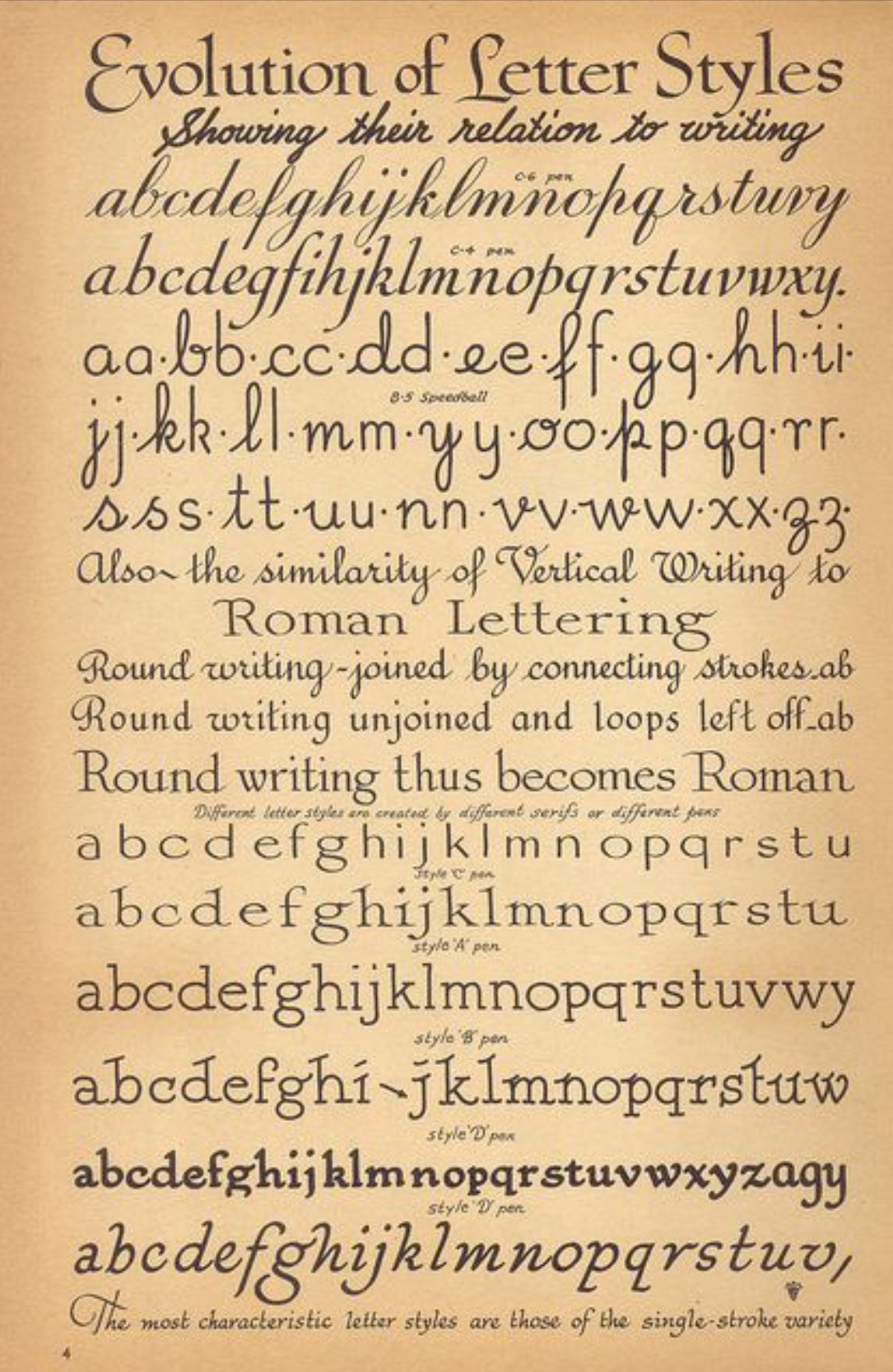
If you want to get a good look at Speedball lettering, you’ll recognize a lot of styles you’ve seen in silent movie titles in the pages of the 8th edition of the Speedball Textbook (1925), posted online here.
Leaving the Quotes Outside
Okay, some final words about the appearance of text in silent movie intertitles before I move on to what sometimes appears behind or around it. I’m not sure why or how the rule about quotation marks came to be for silent films, but in dialog cards, pretty much all of the time quotation marks are outside of the text margins.
This is called Roman Hanging Punctuation. Easier to execute as hand-written lettering or as type-setting, but much less common a paragraph-formatting option in computer programs. Or it was at one point.
I’d been setting the quotation marks manually as separate layers in Photoshop until someone got me hep to the name of this style, and I discovered the justification option for Roman Hanging Punctuation. I still had to raise the height of the quote marks a few points to match what I’d been seeing in titles for years, though.
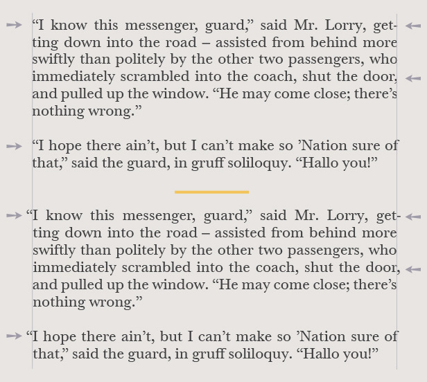
It’s quite possible that the choice to use this format for dialog title cards, as opposed to the way quotation marks were ordinarily used in print media or literature, was to assist in the ease of reading. In silent film, after all, the dialog is not part of a long stream of written pages. It’s inserted into a flow of live-action moving images, held onscreen long enough to be read, and then pulled off again.
Oh, and the name of that typeface you’ve seen in lost of 1920s films? It’s Pastel, and although originally created in 1901 it doesn’t start turning up in movies until around 1923. And then it’s nearly ubiquitous, all the way through the early 1930s. It was turned into a font called “Silentina” in 2004 by Ray Larabie of Typodermic.com.
All in the Timing
I have no idea how this unwritten law of silent film sub-titling came to be, how it was determined or codified. And yet, the screen-time duration of any given “intertitle” appears to be pretty consistent from the late-‘aughts through the end of the silent era, and even into early’30s talkies that still included the occasional sub-title.
There may be an unwritten rule-of-thumb, ubiquitous, of a number of feet of film or of seconds onscreen per word, that everyone just knew and adhered to. But the timing of sentence length and the number of seconds does not waver during the 1910s and 1920s.
I’ve remade or created new intertitles for digital editions of many silent films, and have an internal metronome that seems to kick in for knowing when to cut away from the title and back to the engine. I’ve even checked it against actually measuring the duration of existing titles. It doesn’t quite fit the timing of the adage “you have to be able to read it through twice”. Close, but not quite.
Occasionally, a slapstick short that Steve Massa and I showed on The Silent Comedy Watch Party came to us in a transfer or scan of a print in with “flash titles”—which means that only one or two frames of each title are all that exist. This is the way many silents survive. In extending the flash titles to proper length for our livestream presentation, I found myself looking at the text and reading it and just knowing whether this was a 3-second title, or 4 or 5. I created the freeze frame for the length I figured it’d be, and then played the film back from the shot preceding the title and it felt right. If you want to see an example of this, take a look at A Fraternity Mixup (1926), which we presented on ep. 46 of the show.
Several years ago I was hired to score a silent feature for DVD, one that had been recently restored. When I watched the screener I’d been sent, the film seemed to drag, and unnecessarily so. I couldn’t put my finger on it at first, but eventually realized that all of the title cards were held onscreen a few seconds too long. It turned out that the titles had been newly-made, working from flash titles or one that only survived in too-short lengths. I mentioned this to my contact at the home video outfit, who took another look at the film and agreed…and went to the trouble to go through the film and adjust the duration on all the titles. The film flowed a lot better now.
Did film editors in the 1910s have this gut metronome ticking away? Was there a printed sheet on the wall in editing rooms with a chart for this?
The rhythm of the cut-in sub-titles and their duration on screen is part of the flow of images and information we take in and process with silent film. It may have been so commonplace and done so often with the production and release of the hundreds of films that came out every month that it just became innate for the folks (mainly women, BTW) in the cutting rooms everywhere.
Intertitles for Modern (Contemporary) Times
I’ve covered what I’ve observed in titles cards in silent movies from the ‘teens and ‘twenties in a handful of posts earlier on in this series. I’d like to go over a few points about intertitles again to clarify which aspects of what we’ve all seen are of the silent era and which are not. And which aspects have inadvertently and incorrectly become part of what people think should be done in creating intertitles for silent films.
Let’s start with the look of intertitles (which were originally called sub-titles).
Title Backgrounds
Typically a title card has a black background and white lettering. Working in digital video, you will find that having a plain background that’s 5% black and titles that are 95% white are easier on the eyes. At a certain point in the late ‘teens and early ‘twenties, art titles began being used. I’m sure there are exceptions, but pretty much this was something Thomas H. Ince and his staff really developed and utilized in a big way.
Also starting to appear around the same time are textured backgrounds. They are dark or dark grey, but something that looks like a type of fabric is what the text is laid over. The textured background is something that you see more and more of as the 1920s progress. I printed out a Hal Roach intertitle from a Laurel and Hardy short and brought it in to a carpet store, because the background kind of looked like carpeting. The salesperson I showed it to said, “Oh, yeah…that’s shag.” The Lon Chaney film The Unknown (1925) seems to have its titles laid over burlap. The titles in Keaton’s The General (1927) are laid over a piece of wood.
What I believe was happening here was more than just a design element being added to be fancy or ornate. It’s a lot for your eyes to watch moving images in a wide range of grey tones for a couple of minutes or more and then have that abruptly interrupted by a stark, static image of white text on a black background, and then cut back to the proceedings. The textured background or art title is actually making it easier on your eyes.
This is a human thing, not a 1920s thing.
Yes, many films with art or textured backgrounds also contain straight, white on black title cards. I’ve never quite grasped what the rule was about when to use what, and I’m sure there was an internal logic to this. To some degree. You may want to use this practice for all your titles or some of them. But it does make an easier transition from B&W footage to text and then back.
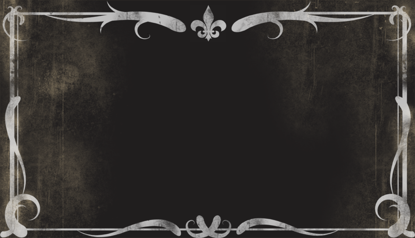
Title Borders
Somewhere along the line, and I blame the conflated memories that were turned into spoofs in the decades that followed the Vitaphone, the trope of the ornate and curlicued title border came into being and was assumed to be part of all silent movies. It wasn’t.
If anything, what you see in silent movies is a simple line border that morrors the shape of the frame. Sometimes — as in Sennett comedies in the 1920s or in Griffith features from the time he was releasing through Fine Arts (late ‘teens to early ‘20s) there might be an added bend or curve between the corners, and sometimes Griffith’s or Sennett’s name would be woven into this. But even when this was used, a certain portion of the titles wouldn’t have this.
My feeling is that this was a combination of branding and what I described above as giving the eyes an easier break from going from a full range of greys to solid black, and then back. The curlicued or frilly borders I’ve seen in silent movies are mainly on main titles, and mostly in early 1910s European films. Even the borders seen in title cards of 1910s Vitagraph films aren’t all that complex.
But the satires and fun-poking at the olde tyme flickers made in the 1930s and onward seem to want to tell us that silent movies are antiques, with the doily-ish borders on their title cards. This has somehow carried over to being assumed as part of the style of silent movies. They’re not. Using them is another way of reminding viewers that they are watching a replication or tribute to the medium, and I don’t think most people realize that the olde timey borders are not actually from the silent era.
They’re also not necessary. Even a simple single-line border may call attention to itself as being relic-styled, and you can play with that that reads as being as you try it out.
Oh, and…please DON’T USE this image (below) for titles and promotional images for silent film shows.
Title text
In the same way, I encourage you to avoid language or wording-styles that sounds like it’s from 100 years ago. The simplicity and economy of title card card writing can be seen in, well, just watching a bunch of silent movies. Want to go down a rabbit hole with this? Just go to the Instagram feed for @SilentFilmTitle. There are tons of frame grabs there.
These will also give you an idea of the word count, typeface size, margins and line-spacing to work with. Not because “that’s the way they did it” but because these settings and typographic styles were designed for the maximum ease of readability.
Bring your title styles into the era or year or decade that you’re making your film in. This goes for typeface/font as well. There is a free font that has the name “Speedball” in it (not to be confused with the real “Speedball” lettering of the 1920s) that I see used in a lot of newer silent movie titles, one where there are curls at the end of the letters, and a typeface I don’t think I’ve ever seen in 1920s films.
Again, take a look at Chaplin’s Modern Times (1936), and you’ll see that he is not using the standard typeface Pastel, now known as the font Silentina, nearly ubiquitous in the late 1920s. He’s made a silent film in 1936, and the titles cards look like 1936 and not 1928. For me, one of the aesthetic things in Mel Brooks’s Silent Movie (1976) that really works is the intertitle style. A simple dark green background and a typeface that is from the 1970s.