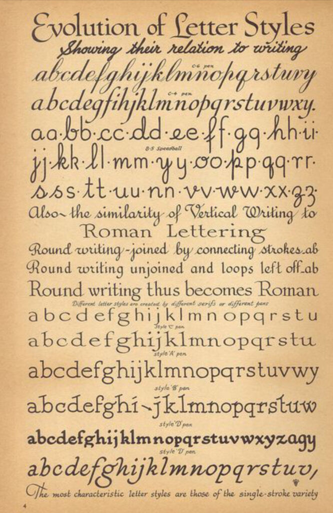
The typefaces and hand-lettering styles in films from the silent era do not have a wide variety, and for the most part they were already familiar to audiences. There are maybe five or six that one sees in a majority of silent movies, but they’re also visible elsewhere, in print media.
With the exception of sub-title (or as we call them today, intertitle) cards from the late ‘aughts and early ‘teens, the typefaces and lettering styles seen are serif ones.
Serif types are the ones where there are little ledges at the tops or bottoms or sides of some of the letters. Sans serif types are the kind without. An easy demo, for anyone who’s used MS Word (or even WordPerfect), is:
Times New Roman is a serif type.
Helvetica is a sans serif type.
Serif types are a little easier to read, and the circa 1907-1914 titles you may see in a sans serif type are also done in all caps. Perhaps a sans serif type was easier to read as all caps, and perhaps this format was thought to be easier for late-Nickelodeon-era moviegoers for whom English was not their first language.
The typefaces that were either known or are now known as Bookman, Cheltenham and Artcraft are visible in lots of print advertising from the era. Flip through the motion picture trade magazines available on Media History Digital Library and you’ll see a lot of these used in ads.
The other kind of lettering you’ll see in silent era titling is often referred to as Speedball. It’s a hand-lettering style that came about through the introduction of the Speedball ink pen nib in 1915 and became popular and was in use both by graphic designers and title artists in the late ‘teens and throughout the 1920s. If you’ve seen any silent features released by Paramount or United Artists, you’ve seen a variety of styles of Speedball lettering.

If you want to get a good look at Speedball lettering, you’ll recognize a lot of styles you’ve seen in silent movie titles in the pages of the 8th edition of the Speedball Textbook (1925), posted online here.
There’s a reason I did not write the capitalized “Silent Film” above, as I’ve used the name in previous posts. This is because the fonts, as we now call these, are not necessarily locked to the medium of Silent Film itself, but were in use in the 1910s and 1920s in film. I should probably write up something about my usage of the term and what refers to and what it doesn’t. I will, and also at the end of all of this I will have a section on silent movies made after talkies ended the medium and on making them today.
The first post in this series is here.
The previous post (#25) to this one is here.
The next one (#27) is here.
