I’ve covered what I’ve observed in titles cards in silent movies from the ‘teens and ‘twenties in a handful of posts earlier on in this series. I’d like to go over a few points about intertitles again to clarify which aspects of what we’ve all seen are of the silent era and which are not. And which aspects have inadvertently and incorrectly become part of what people think should be done in creating intertitles for silent films.
Let’s start with the look of intertitles (which were originally called sub-titles).
Title Backgrounds
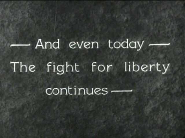
Typically a title card has a black background and white lettering. Working in digital video, you will find that having a plain background that’s 5% black and titles that are 95% white are easier on the eyes. At a certain point in the late ‘teens and early ‘twenties, art titles began being used. I’m sure there are exceptions, but pretty much this was something Thomas H. Ince and his staff really developed and utilized in a big way.
Also starting to appear around the same time are textured backgrounds. They are dark or dark grey, but something that looks like a type of fabric is what the text is laid over. The textured background is something that you see more and more of as the 1920s progress. I printed out a Hal Roach intertitle from a Laurel and Hardy short and brought it in to a carpet store, because the background kind of looked like carpeting. The salesperson I showed it to said, “Oh, yeah…that’s shag.” The Lon Chaney film The Unknown seems to have its titles laid over burlap. The titles in Keaton’s The General are laid over a piece of wood.
What I believe was happening here was more than just a design element being added to be fancy or ornate. It’s a lot for your eyes to watch moving images in a wide range of grey tones for a couple of minutes or more and then have that abruptly interrupted by a stark, static image of white text on a black background, and then cut back to the proceedings. The textured background or art title is actually making it easier on your eyes.
This is a human thing, not a 1920s thing.
Yes, many films with art or textured backgrounds also contain straight, white on black title cards. I’ve never quite grasped what the rule was about when to use what, and I’m sure there was an internal logic to this. To some degree. You may want to use this practice for all your titles or some of them. But it does make an easier transition from B&W footage to text and then back.

Title Borders
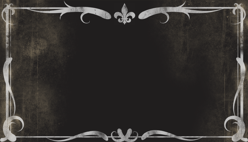
Somewhere along the line, and I blame the conflated memories that were turned into spoofs in the decades that followed the Vitaphone, the trope of the ornate and curlicued title border came into being and was assumed to be part of all silent movies. It wasn’t.
If anything, what you see in silent movies is a simple line border that morrors the shape of the frame. Sometimes — as in Sennett comedies in the 1920s or in Griffith features from the time he was releasing through Fine Arts (late ‘teens to early ‘20s) there might be an added bend or curve between the corners, and sometimes Griffith’s or Sennett’s name would be woven into this. But even when this was used, a certain portion of the titles wouldn’t have this.
My feeling is that this was a combination of branding and what I described above as giving the eyes an easier break from going from a full range of greys to solid black, and then back. The curlicued or frilly borders I’ve seen in silent movies are mainly on main titles, and mostly in early 1910s European films. Even the borders seen in title cards of 1910s Vitagraph films aren’t all that complex.
But the satires and fun-poking at the olde tyme flickers made in the 1930s and onward seem to want to tell us that silent movies are antiques, with the doily-ish borders on their title cards. This has somehow carried over to being assumed as part of the style of silent movies. They’re not. Using them is another way of reminding viewers that they are watching a replication or tribute to the medium, and I don’t think most people realize that the olde timey borders are not actually from the silent era.
They’re also not necessary. Even a simple single-line border may call attention to itself as being relic-styled, and you can play with that that reads as being as you try it out.
Oh, and…please stop using this image (below) for titles and promotional images for silent film shows.

Title text
In the same way, I encourage you to avoid language or wording-styles that sounds like it’s from 100 years ago. The simplicity and economy of title card card writing can be seen in, well, just watching a bunch of silent movies. Want to go down a rabbit hole with this? Just go to the Instagram feed for @SilentFilmTitle. There are tons of frame grabs there.
These will also give you an idea of the word count, typeface size, margins and line-spacing to work with. Not because “that’s the way they did it” but because these settings and typographic styles were designed for the maximum ease of readability.
Bring your title styles into the era or year or decade that you’re making your film in. This goes for typeface/font as well. There is a free font that has the name “Speedball” in it (not to be confused with the real “Speedball” lettering of the 1920s) that I see used in a lot of newer silent movie titles, one where there are curls at the end of the letters, and a typeface I don’t think I’ve ever seen in 1920s films.
Again, take a look at Chaplin’s Modern Times (1936), and you’ll see that he is not using the standard typeface Pastel, now known as the font Silentina, nearly ubiquitous in the late 1920s. He’s made a Silent Film in 1936, and the titles cards look like 1936 and not 1928. For me, one of the aesthetic things in Mel Brooks’s Silent Movie (1976) that really works is the intertitle style. A simple dark green background and a typeface that is from the 1970s.
A few thoughts on story and plot and characters next, then I think it’ll be time to wrap this all up.
The first post in this series is here.
The previous post (#62) to this one is here.
The next post (#64) is here.